Client: SKC, Inc.
Better management of air quality sample data.
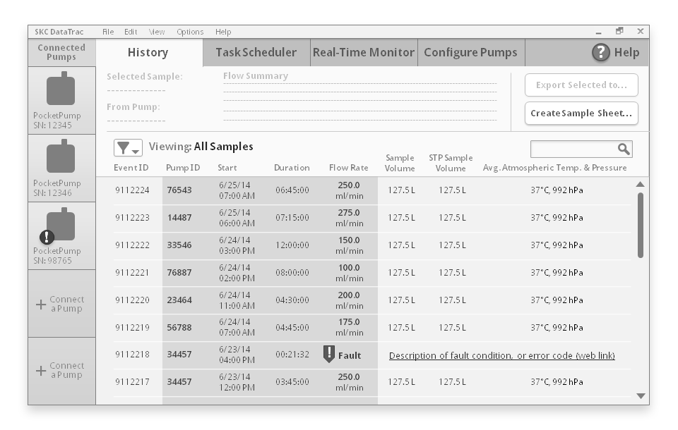
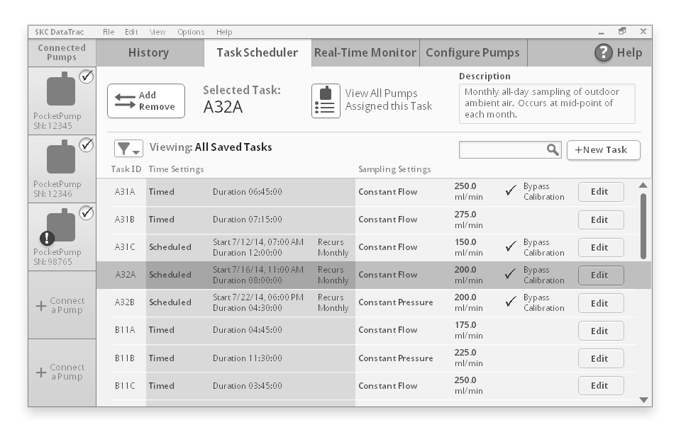
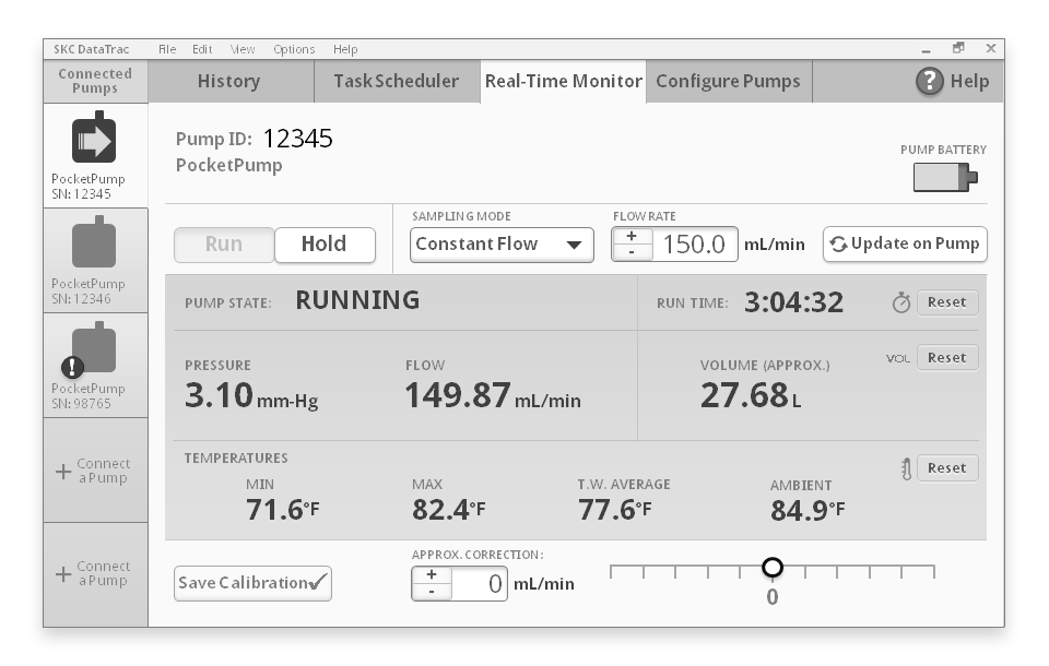
Above: Detailed wireframes
DataTrac Pro is a Windows desktop app that lets air quality professionals program air collection pumps and organize air sample records. SKC, Inc. is a world leader in scientific air sampling equipment. SKC's small air pumps, mounted on city roofs or at industrial work sites, periodically collect air samples, saving data about each sample. Air quality scientists must program these pumps, and analyze the large set of samples generated over time.
Role
SKC's business goal was the release of a completely new Windows app to replace the prior DataTrac, which was a fully-featured but outdated application. I led the early and mid-project UX design efforts, working with one other UX designer to define the app's structure and visual style, then passed the baton to my teammate for more detailed visual design and changes during engineering.
Goals
Increase speed, efficiency, and the visibility of data important for users' quick decisions.
• Allow live connection to multiple pumps at once, including test runs of two or more pumps at a time, and copying/cloning of settings between pumps. Previous software was limited to connecting to one pump at a time.
• Provide immediate visibility of many air sample records on each connected pump, with enough previewed information about each sample to enable decisions about which samples to keep for analysis, and which to delete or archive.
Provide a user experience dramatically more flexible and modern-looking than the previous SKC software and competitors' software.
• Merge what was then a set of separate windows and pop-ups into a single, well-structured UI. Customers generally were not placing the separate windows side-by-side. The mixture of separate windows with modal dialogues was also confusing.
• Introduce a contemporary visual style that is bold, polished, trustworthy, and looks equally appropriate in Windows 7, 8, and 10.
Process & Solutions
Deep Dive: In a valuable half-day session, my colleagues and I drew domain knowledge from the client. We mapped the steps users would ideally take, and how our application could support those steps.
• We learned that lab technicians must do test runs with pumps, before confidently sending those pumps out into the field. Later, they must review large batches of samples from the field to verify their quality. DataTrac would be their key tool for this preparation and review, and for diagnosing problems with pumps.
• We agreed that aspects of the desktop software must be consistent with the UI of SKC air pumps. If users encounter the same UI patterns in both places, the entire user experience will be more easily learned and retained.
• We learned that filing hard-copy reports with safety inspectors is still quite important in this field. The ability to quickly export any air sample record into a print-ready template would have major appeal.
Interaction Design: Over four weeks with weekly reviews by SKC, we developed ideas for grouping features, and for laying out information and user interaction points.
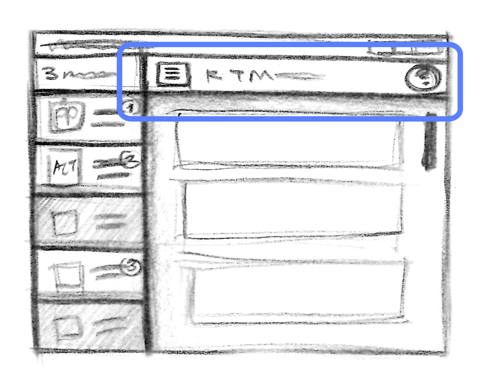
• To replace the older app's many windows, we designed a UI with prominent tabbed navigation, similar to what user have come to expect from modern, often web-based UIs. It was made an engineering priority for the app to switch quickly and responsively between the tabbed panels, allowing users to freely multitask.
Considering tabbed vs. menu navigation between task-focused screens:
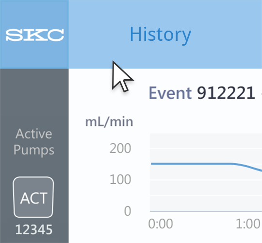
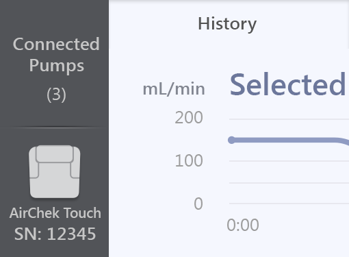
• Connecting and selection of multiple pumps stood out as a complex use case that would need extra attention. We designed a slim, efficient left side panel that serves as [1] a call-to-action to connect a pump, [2] an index of connected pumps, [3] a way to select one or multiple pumps for inspection or a batch action, and [4] a place for prominent indication of status, progress, and errors.
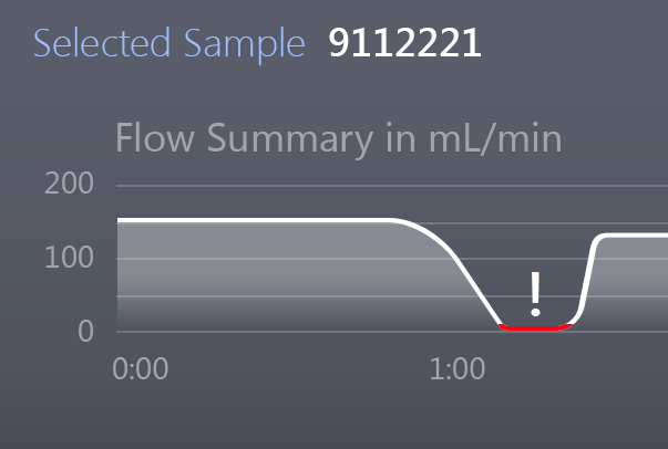
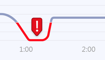
• It was challenging to find the right amount of information to furnish for each air sample record. We considered a detailed, scrollable line graph viewer with zoom levels, and overlaying of multiple samples for comparison. Returning to our knowledge of users, we settled on a simple, summary graph for just one sample at a time. The graph would automatically highlight any problem that makes the sample's data unusable. Inspired by the concept of a sparkline, we designed a minimal line graph that conveys just the main thrust of the sample’s data, at a glance.
Click image for more:
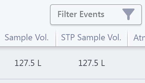
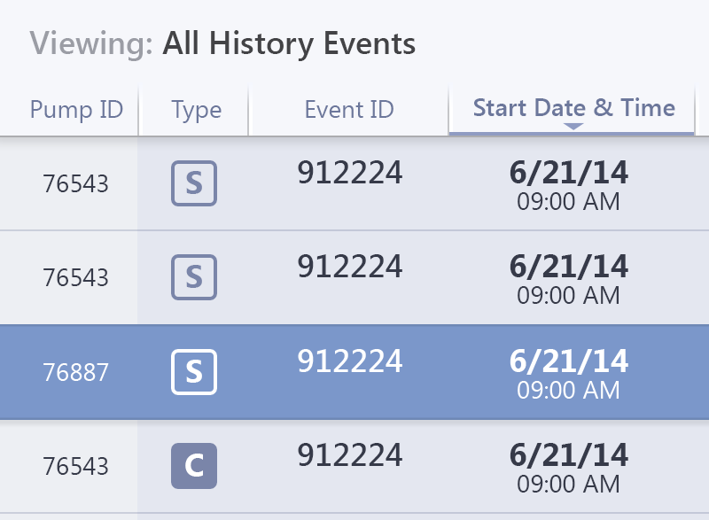
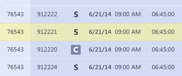
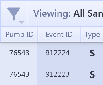
• For an index of scheduled tasks, we chose an easily skimmed table with clickable headers for sorting. Tasks would have a thin, minimal appearance in the list, but would expand into a richly detailed UI for adjusting their settings. We explored different solutions for managing tasks among pumps, from storing all tasks on the pumps and using DataTrac to "trade" tasks between them, to keeping a master task library in DataTrac from which to pull tasks for pump assignment. We considered different list and panel layouts, seeking simplicity and speed for users with many pumps and many air sampling goals.
Click image for more:
Visual Design
With the prior DataTrac being engineering-driven and using entirely stock UI elements, we seized the opportunity to introduce a visual language for SKC software, going forward.
• I led the team in generating multiple style concepts, and successfully communicated the value and impact of visual design to SKC.
• We focused on SKC's reputation for precision, conveying it back to customers with crisp panel edges and thin-lined UI elements. After producing four visual design concepts (three that I designed or directly contributed to are shown below) we worked with the client to select one direction. It uses a flat style, and a vibrant blue brand color that SKC is interested in carrying forward.
• I passed the baton to my UX teammate for further visual design, asset production, and updates during the engineering process.
Visual design mock-ups and final concept:
Visual design concept details:
Outcome
Engineers at SKC view DataTrac Pro as a major new offering that is likely to translate to increased sales in the coming months. Coupled with the new AirChek Touch pump that was introduced along with it, this Windows app is a powerfully simple tool for air quality professionals.

